
Ambassador Sign Up
I redesigned Study.com’s referral sign-up page to convert better and to showcase top creators.
- Redesigned the referral sign-up page to improve registrations.
- Wrote succinct instructions and value props.
- Showcased top posts by creators and created entry points for recent posts.
- Improved the referral flow and unlocked a valuable revenue stream.
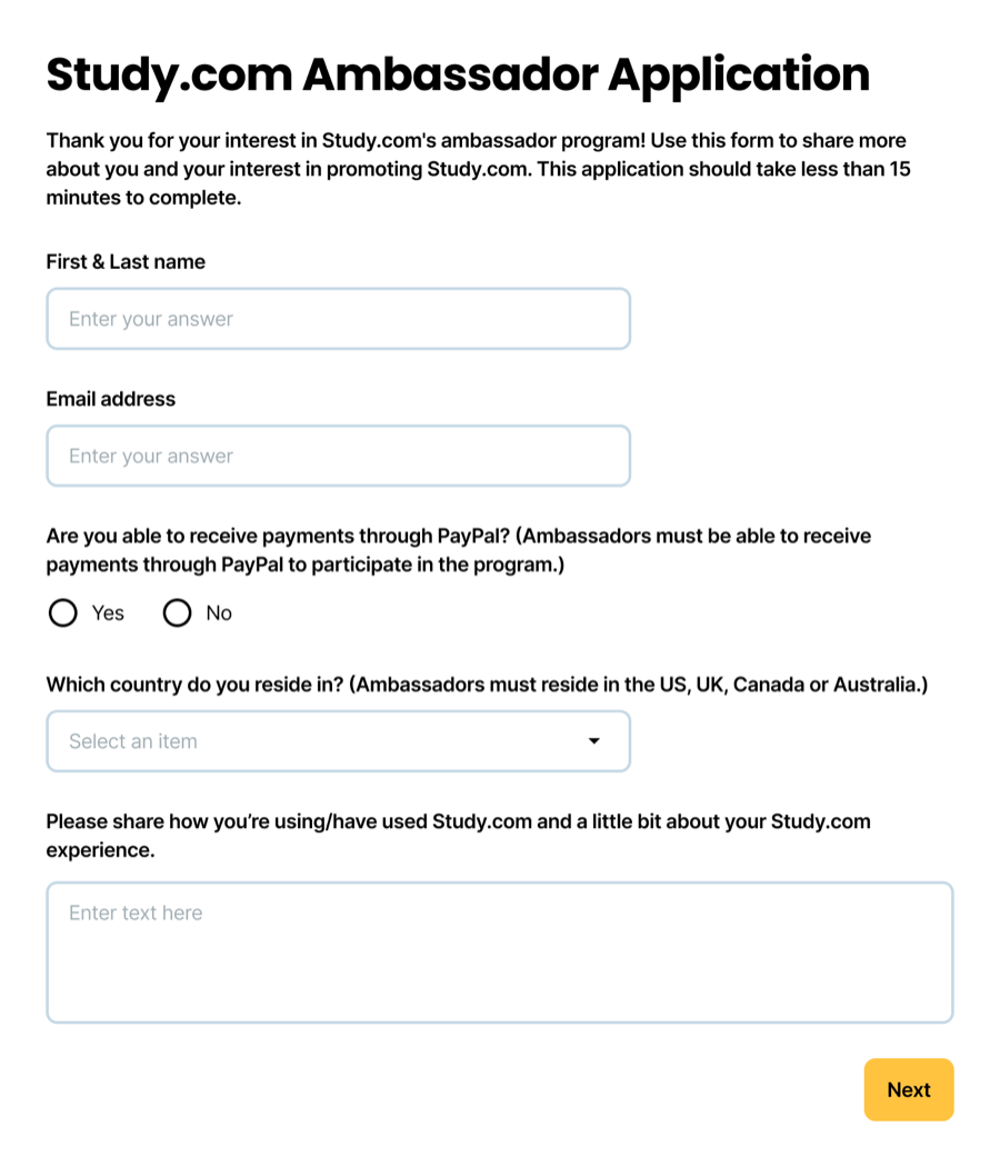
Redesigned to improve registrations
Study.com's referral program relied on content creators called "Ambassadors" to explain Study.com's college credit and test prep subscriptions. The referral landing page included a multi-step sign-up process and lacked any examples of good content.
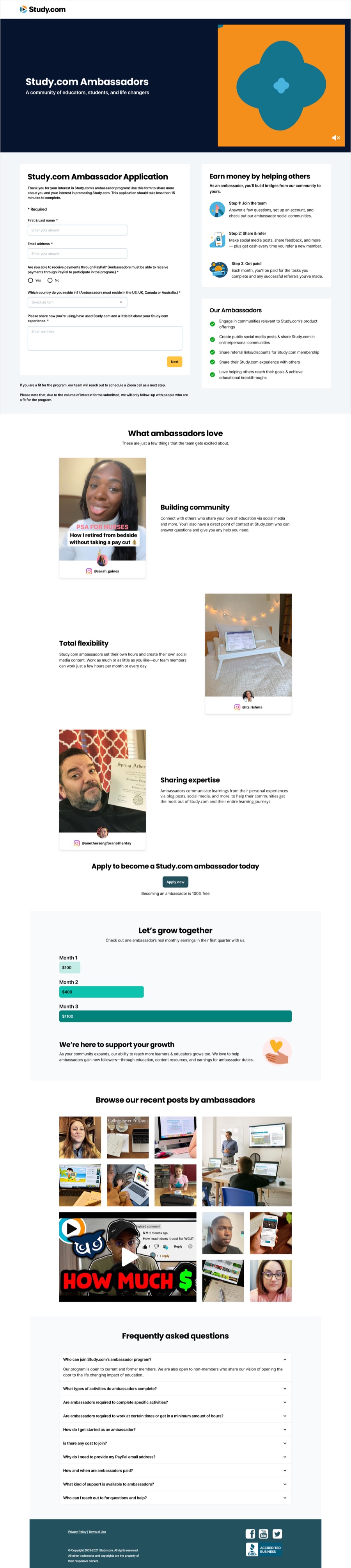
I approached the problem in two ways: First I simplified the sign-up process and reduced the form from 3 pages to 1. Next, I introduced real content examples through video clips and entry points to Instagram and TikTok.

Succinct instructions & value props
The original page was dense and text-heavy. From interviews with Ambassadors I learned that they really just wanted basic facts and a quick understanding of the terms. I simplified the text while making it clearer.
To reduce cognitive load, I made a simple list and elevated the prominence on the page. Illustrations made the instructions easier to understand.

Entry points to real posts
The previous page used static screenshots which added little visual interest and got stale pretty fast. I replaced those with a grid of recent posts from approved content creators.
The new system empowered moderators to refresh content and gave visitors real examples of how to build their posts.
A simpler flow recharged a revenue stream
I improved the registration flow, helped users quickly understand the product offering, and gave them real examples to work from. The company targeted ambassadors as a growth channel in 2026. Alongside increased marketing investment, the redesign helped grow the channel 4% year over year.
The revenue gain came from fixing the obvious problem (reg form), but also from uncovering the deeper user needs of clear instruction and timely examples.